Google Ads Analytics
📊 Your Google Ads are running, the budget is being spent, but figuring out what's actually working usually means jumping between reports, exporting CSVs, and losing time you don't have. ContentStudio's Google Ads Analytics brings everything into one clean dashboard so you can track spend, clicks, conversions, and campaign performance across your entire account without ever opening Google Ads Manager.
In this Article:
Connecting Your Google Ads Account
1 Click your profile icon in the bottom left corner, then select Social Accounts from the Workspace Settings section.
2 Click Connect Social Account, scroll down to Google Ads in the modal, and click the + icon next to it.
3 Complete the Google authentication flow. Once done, select the Google Ads account you want to use for analytics.
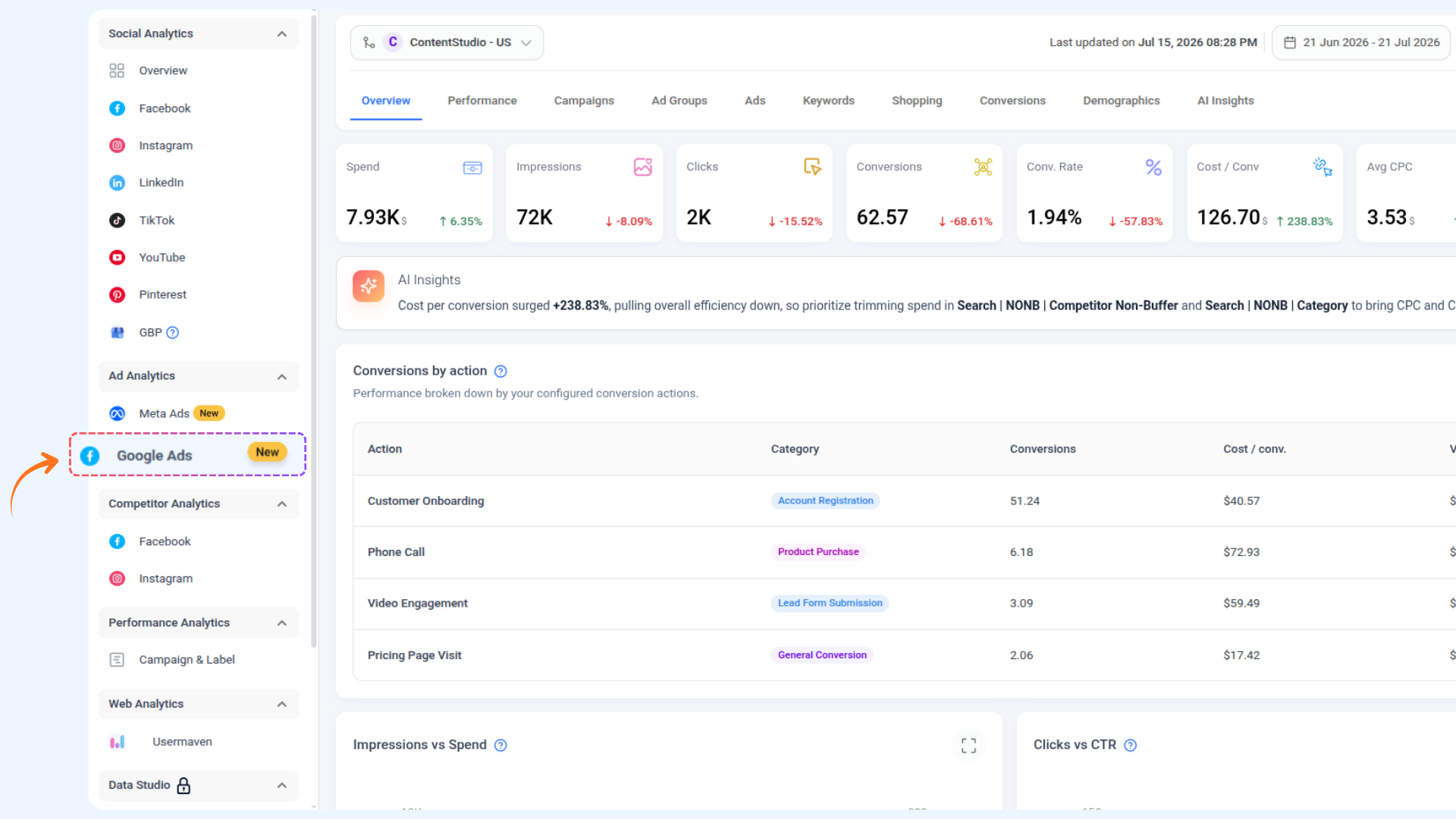
4 Go to Analytics from the left sidebar, then select Google Ads under the Ad Analytics section.
Google Ads Analytics gives you a full view of your ad performance across all your campaigns for any date range you choose. Here is a quick look at what is on the screen before we go tab by tab.
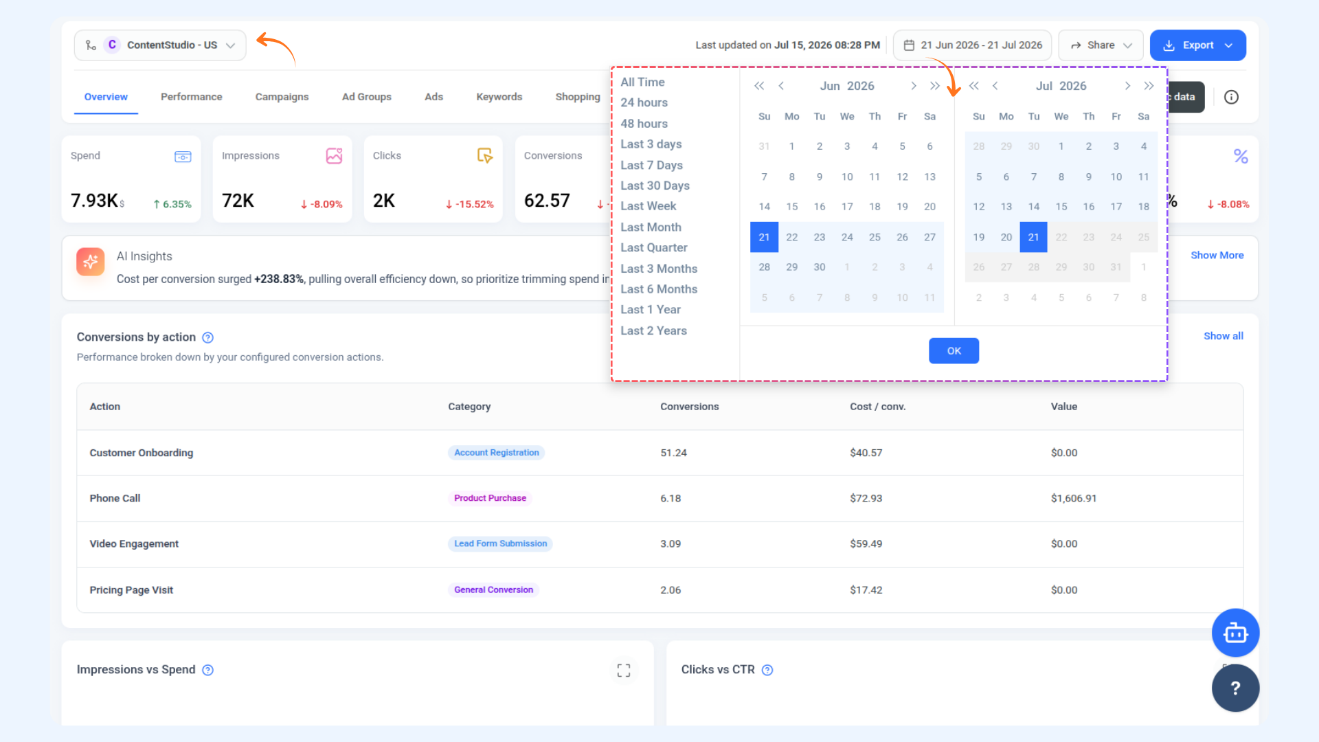
Account Selector — The dropdown in the top left shows your currently selected Google Ads account. Click it to switch between any connected ad accounts.
Date Range Picker — Click the calendar dropdown at the top to set your reporting period. You can choose from presets like Last 7 Days, Last 30 Days, Last Month, Last Quarter, Last 6 Months, Last 1 Year, Last 2 Years, or set a fully custom date range using the calendar. Click OK to apply.
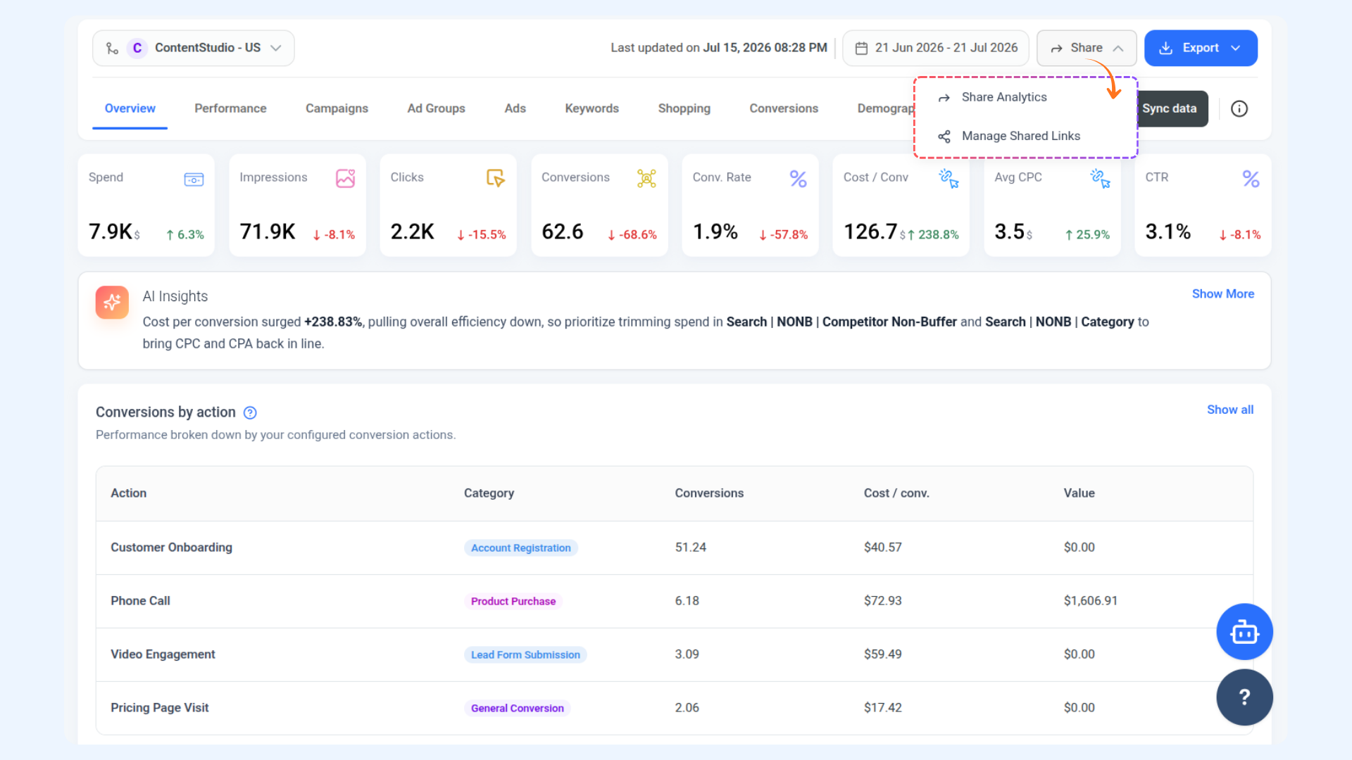
Share — Click the Share button to either Share Analytics by generating a shareable link, or Manage Shared Links to view and control any links you have already shared.
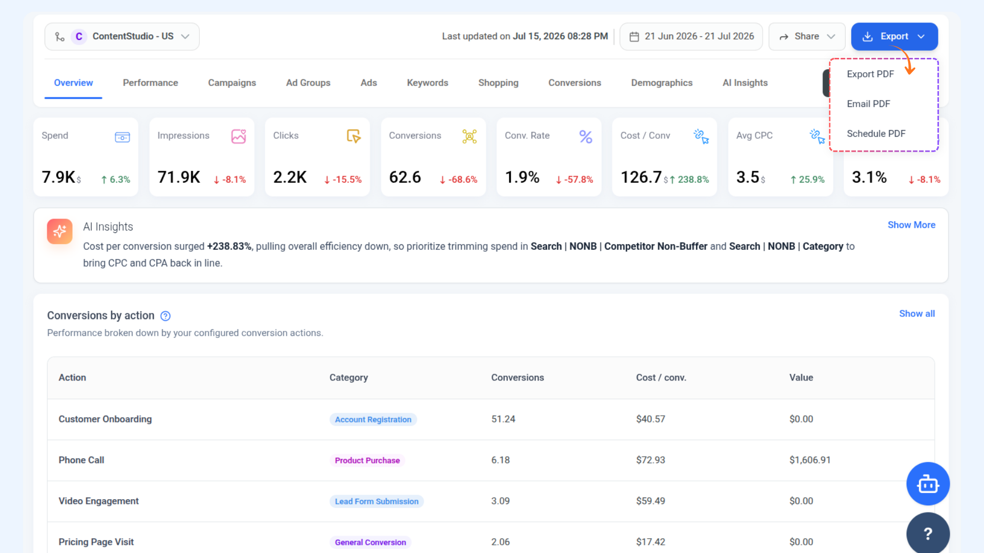
Export — Click Export to download or send your analytics report. You have three options: Export PDF to download it directly, Email PDF to send it to an email address, or Schedule PDF to set up recurring automated delivery.
Sync Data — Click the Sync data button to manually pull the latest data from Google Ads. This is especially useful if you notice any missing or outdated numbers for your selected date range.
💡
Data Is Not Live ContentStudio does not refresh your Google Ads data automatically. Click Sync data any time you want to make sure you are looking at the most current numbers.
Overview of Google Ad Analytics
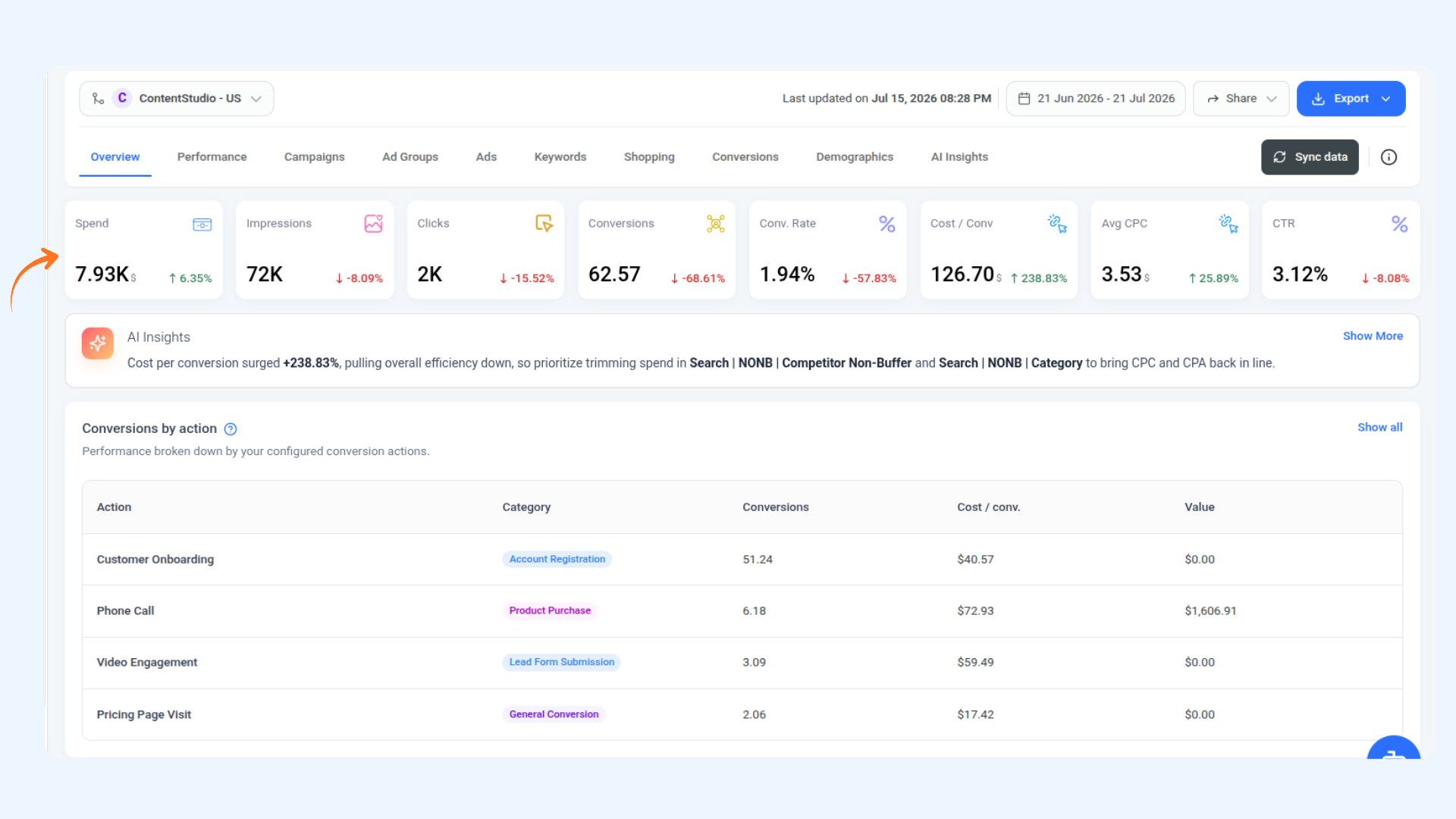
When you first open Google Ads Analytics, the Overview is where you land. It gives you a quick pulse check on your entire account without having to dig into individual campaigns or reports. Everything important is in one place — how much you have spent, how many people you reached, whether your clicks and conversions are trending up or down, and a snapshot of your top performing campaigns. It is the best place to start every time you open the section.
| Metric |
What It Shows |
| Spend |
Total amount spent across all campaigns during the selected time period |
| Impressions |
Total impressions across all campaigns during the selected time period |
| Clicks |
Total clicks across all campaigns during the selected time period |
| Conversions |
Total conversions recorded across all campaigns during the selected time period |
| Conv. Rate |
Conversions divided by interactions during the selected time period |
| Cost / Conv |
Average cost per conversion during the selected time period |
| Avg CPC |
Average cost per click during the selected time period |
| CTR |
Average click through rate during the selected time period |
Conversions by Action
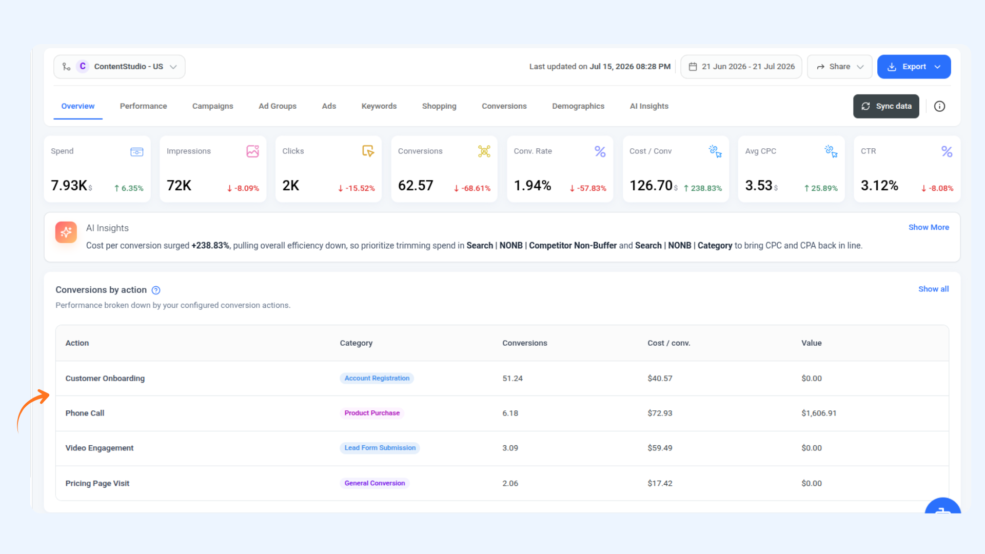
Below the AI Insights banner, the Conversions by Action table breaks down your total conversions by the specific conversion actions you have configured in Google Ads, for example Customer Onboarding, Phone Call, Video Engagement, or Pricing Page Visit.
Each row shows the Action name, its Category (such as Account Registration, Product Purchase, or Lead Form Submission), the total number of Conversions, the Cost per Conversion, and the total Value attributed to that action.
Click Show all on the right to see the full list of conversion actions beyond the default preview.
💡
Conversion Actions Come from Google Ads The actions shown here are pulled directly from your Google Ads account. If you want to add or change conversion actions, you will need to do that inside Google Ads and then sync the data in ContentStudio.
Impressions vs Spend and Clicks vs CTR Charts
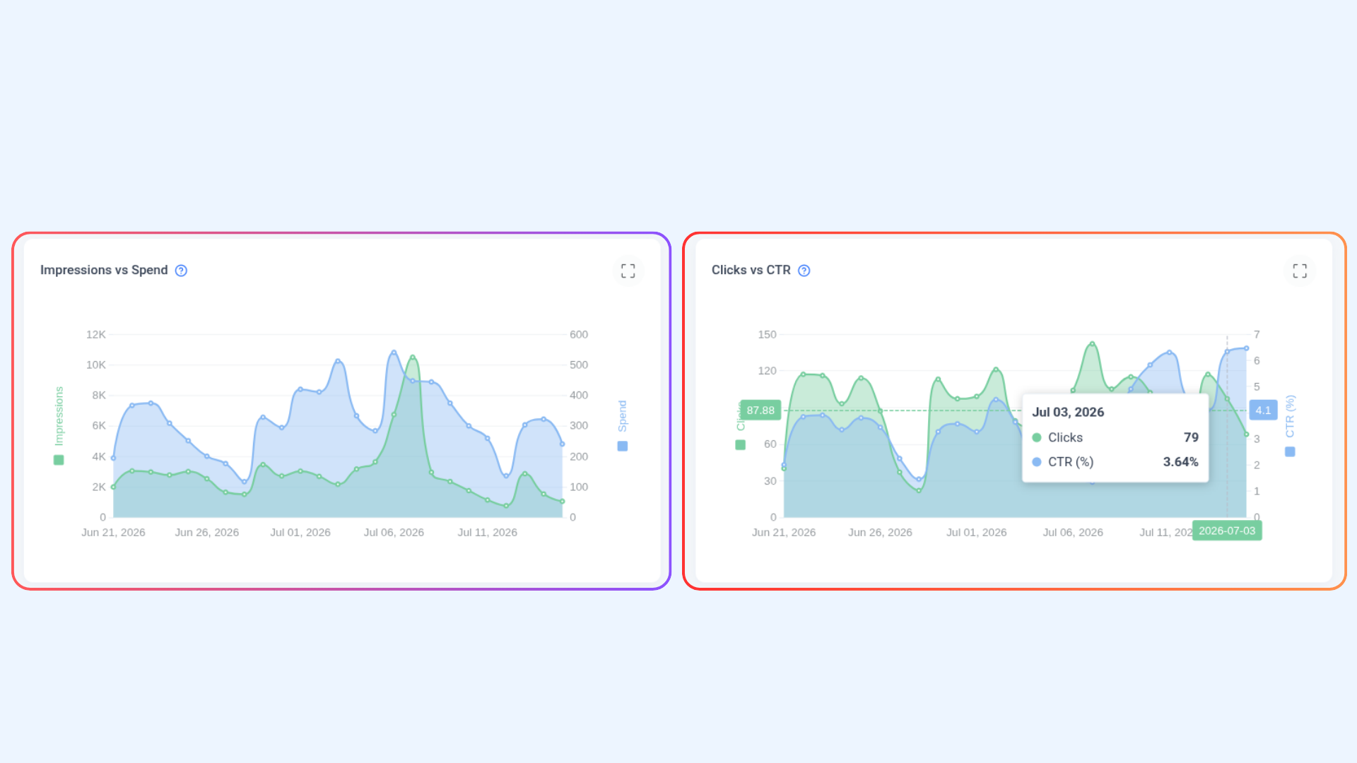
Impressions vs Spend — This chart plots your daily Impressions (left axis, green line) against your daily Spend (right axis, blue shaded area) across the selected period. It helps you quickly see whether your delivery and budget are moving together. If spend is holding steady but impressions are dropping, your CPM is rising and you are getting less reach for the same budget.
Clicks vs CTR — This chart plots your daily Clicks (left axis, green line) against your CTR percentage (right axis, blue shaded area). Hover over any point on the chart to see the exact date, click count, and CTR for that day. A declining CTR alongside stable impressions is a clear signal that your ads are losing relevance with your audience.
Both charts share the same date range as the rest of the Overview tab. You can expand either chart to full screen by clicking the expand icon in the top right corner of the chart.
Top 5 Campaigns
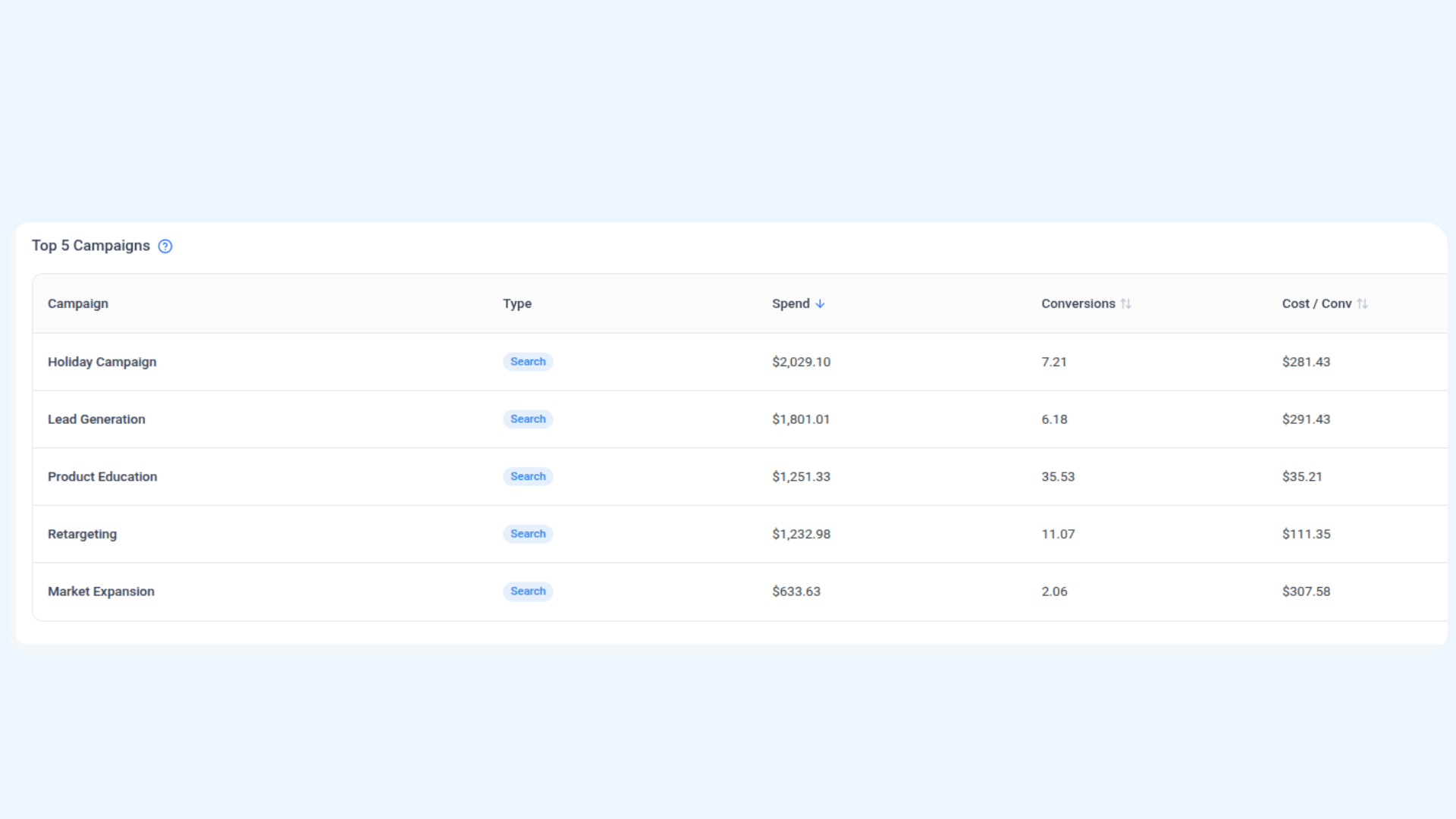
At the bottom of the Overview tab, the Top 5 Campaigns table shows your five highest-spend campaigns for the selected period. Each row shows the Campaign name, its Type (such as Search), total Spend, total Conversions, and Cost per Conversion.
This table is sorted by Spend by default. Click View all in the top right of the section to jump to the full Campaigns tab where you can see every campaign and sort by any column.
💡
High Spend Does Not Always Mean High Performance A campaign can be your biggest spender while having a high cost per conversion. Use this table to quickly spot campaigns where spend is high but conversions are low, then investigate further in the Campaigns tab.
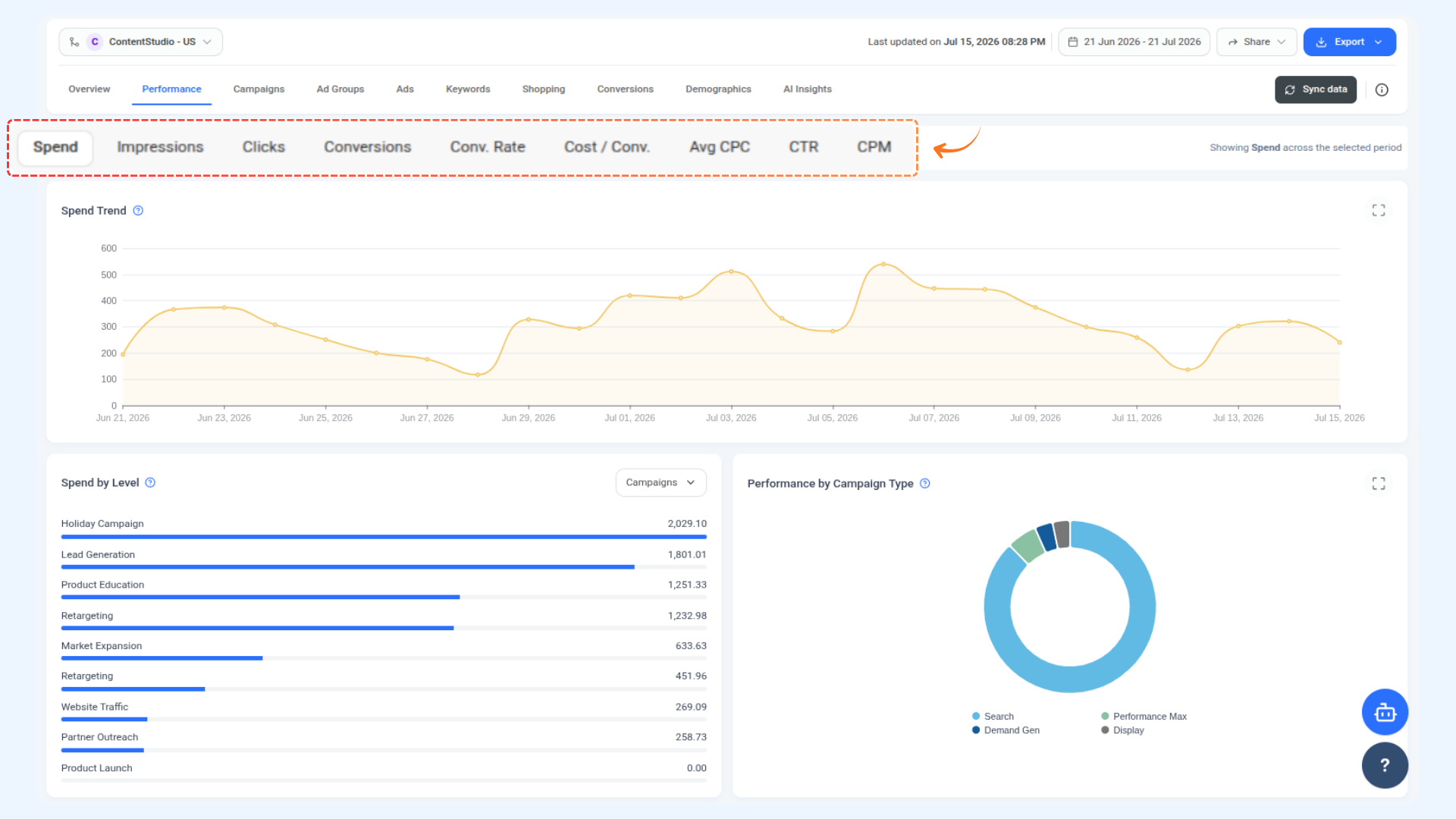
The Performance section is where you go when you want to see how any metric has been trending over time. Pick the one you want to look at from the bar at the top and all the charts below will update to show it. Every metric follows the same layout, so once you are familiar with one, you are good to go for all of them.
Spend Trend — A line chart showing your total daily spend plotted across the selected date range. Peaks usually point to budget increases or new campaigns going live. Sharp drops typically mean a campaign was paused or a daily budget cap was hit. Hover over any point to see the exact date and value.
Spend by Level — A horizontal bar chart ranking your campaigns by total spend, highest first. Use the dropdown (defaulting to Campaigns) to switch the grouping to Ad Groups or Ads and see where budget is concentrated at any level of your account.
Performance by Campaign Type — A donut chart on the right showing how your total spend is split across your Google Ads campaign types: Search, Performance Max, Demand Gen, and Display. Hover over any segment to see the exact spend and percentage share for that type.
💡
Same Layout for Every Metric Every metric button in Performance follows this exact same three-part layout — a Trend chart, a By Level bar chart, and a Performance by Campaign Type donut chart. So whether you are looking at Impressions, Clicks, Conversions, Conv. Rate, Cost / Conv., Avg CPC, CTR, or CPM, the structure is always the same. Only the data changes.
Campaigns
The Campaigns section gives you a complete view of every campaign running in your account, all in one table. Instead of clicking through each campaign individually in Google Ads, you can see how all of them are performing side by side, sort by any metric, filter by campaign type, and customise exactly which numbers you want to look at.
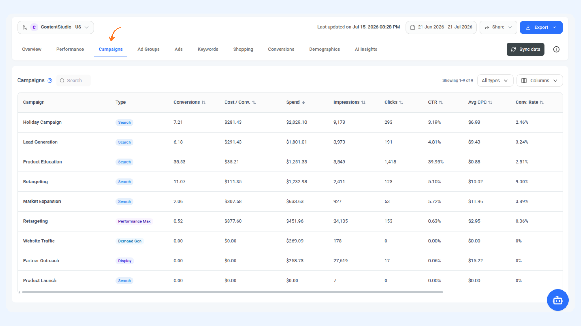
Search — Use the search bar at the top left to find a specific campaign by name.
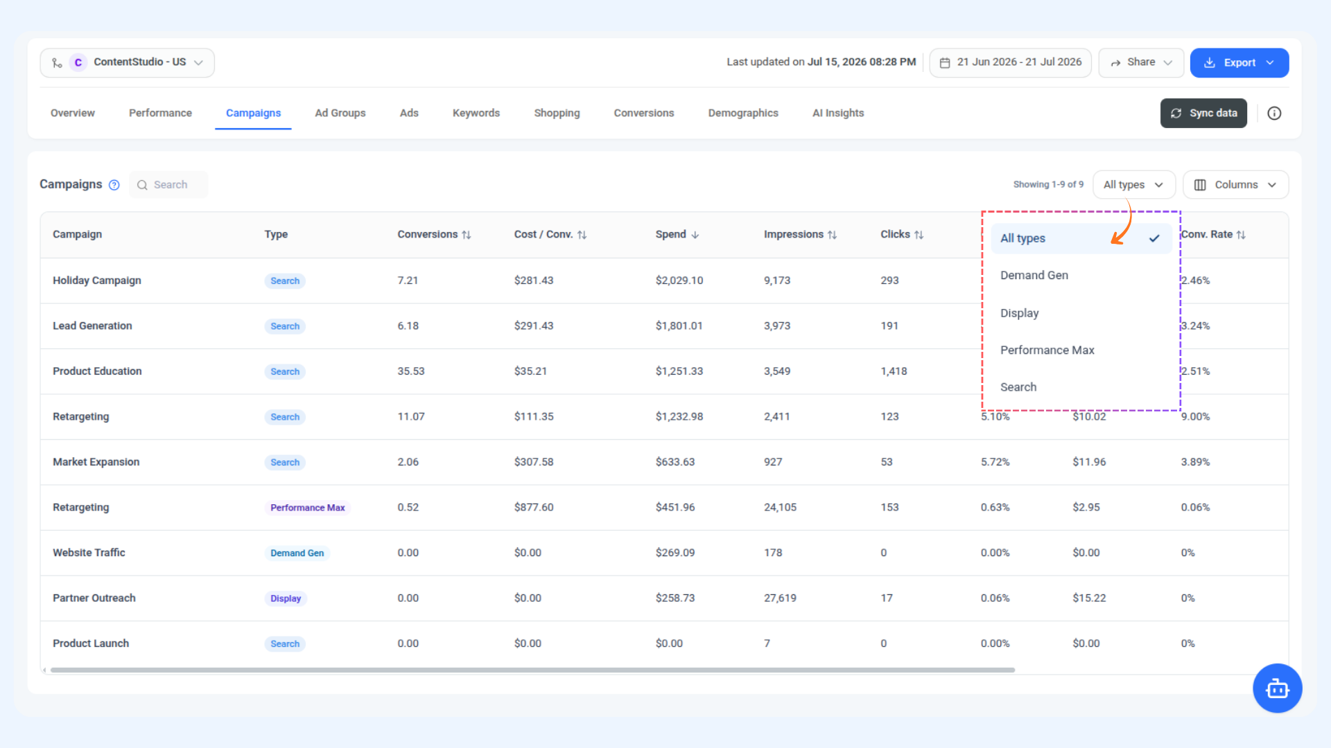
Filter by Type — Click the All Types dropdown to narrow the table down to a specific campaign type. You can filter by Search, Display, Demand Gen, or Performance Max.
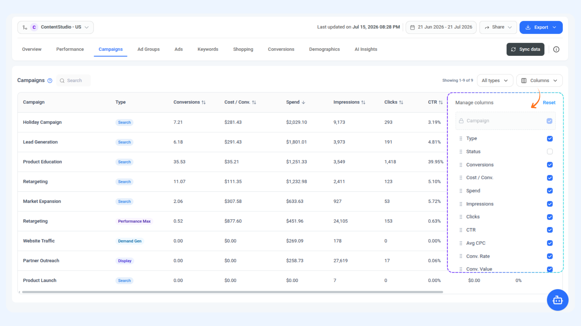
Manage Columns — Click the Columns button to choose which metrics you want to see in the table. Check or uncheck any column to show or hide it, and drag them to reorder. Available columns include Type, Status, Conversions, Cost / Conv., Spend, Impressions, Clicks, CTR, Avg CPC, Conv. Rate, and Conv. Value.
Sort the Table — Click on any column header to sort the entire table by that metric. Click once to sort ascending, click again to sort descending. This makes it easy to instantly find your highest-spend campaigns, lowest cost-per-conversion performers, or anything else you want to prioritise.
💡
Campaign column is always visible The Campaign name column is locked and cannot be hidden or moved. All other columns can be freely toggled and reordered to match how you prefer to review your data.
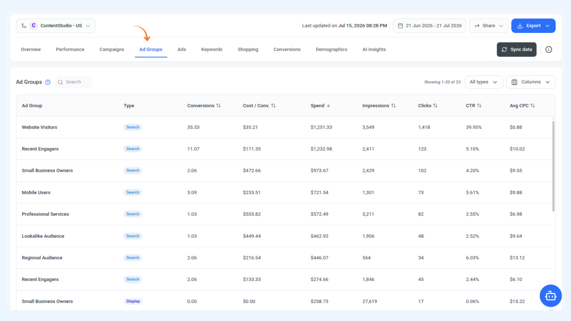
Ad Groups
If campaigns are the big picture, ad groups are where things get more specific. This section lets you review how each ad group is performing within your campaigns, so you can spot which groups are pulling their weight and which ones might need some attention.
Search — Use the search bar to find a specific ad group by name.
Filter by Type — Click the All Types dropdown to narrow the table to a specific campaign type. You can filter by Search, Display, Demand Gen, or Performance Max.
Choose What You See — Click the Columns button to show or hide metrics and drag them into whatever order works best for you.
Sort by What Matters to You — Click any column header to sort the table by that metric. Click once for ascending, click again for descending. Great for quickly finding your best or worst performing ad groups across any metric.
Ads
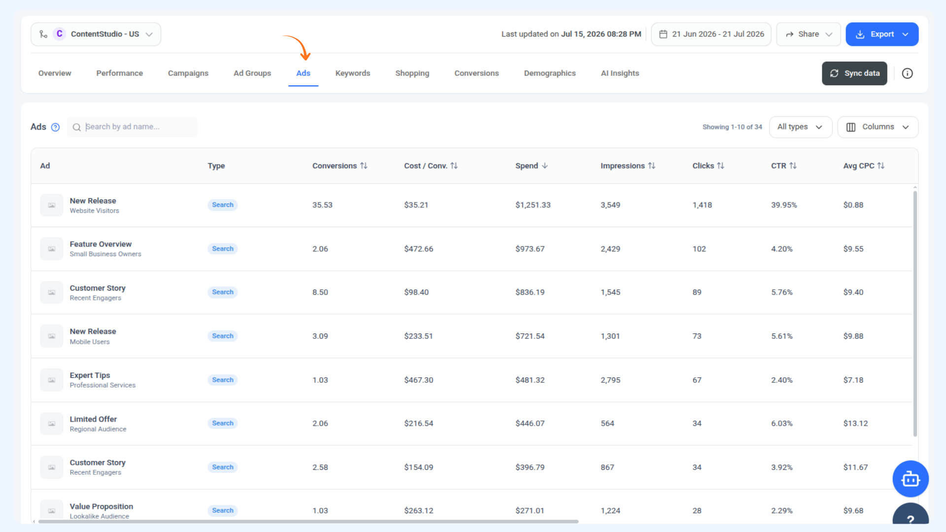
While Campaigns shows you the big picture and Ad Groups help you narrow things down, the Ads section takes you all the way to the individual creative level. You can see exactly which ads are driving conversions, which ones are getting clicks but not converting, and where your cost per conversion is highest — all in one place.
Search — Use the search bar to find a specific ad by name.
Filter by Type — Click the All Types dropdown to narrow the table to a specific campaign type. You can filter by Search, Display, Demand Gen, or Performance Max.
Choose What You See — Click the Columns button to show or hide metrics and drag them into whatever order works best for you.
Sort by What Matters to You — Click any column header to sort the table by that metric. Click once for ascending, click again for descending. This is especially useful for spotting your highest converting ads or finding the ones with the lowest CTR that might need a refresh.
Keywords
Keywords is one of the most useful places to check if you want to understand what is actually driving traffic to your ads. This section is split into two views that you can switch between at the top: your bidded keywords and the actual search terms that triggered them.
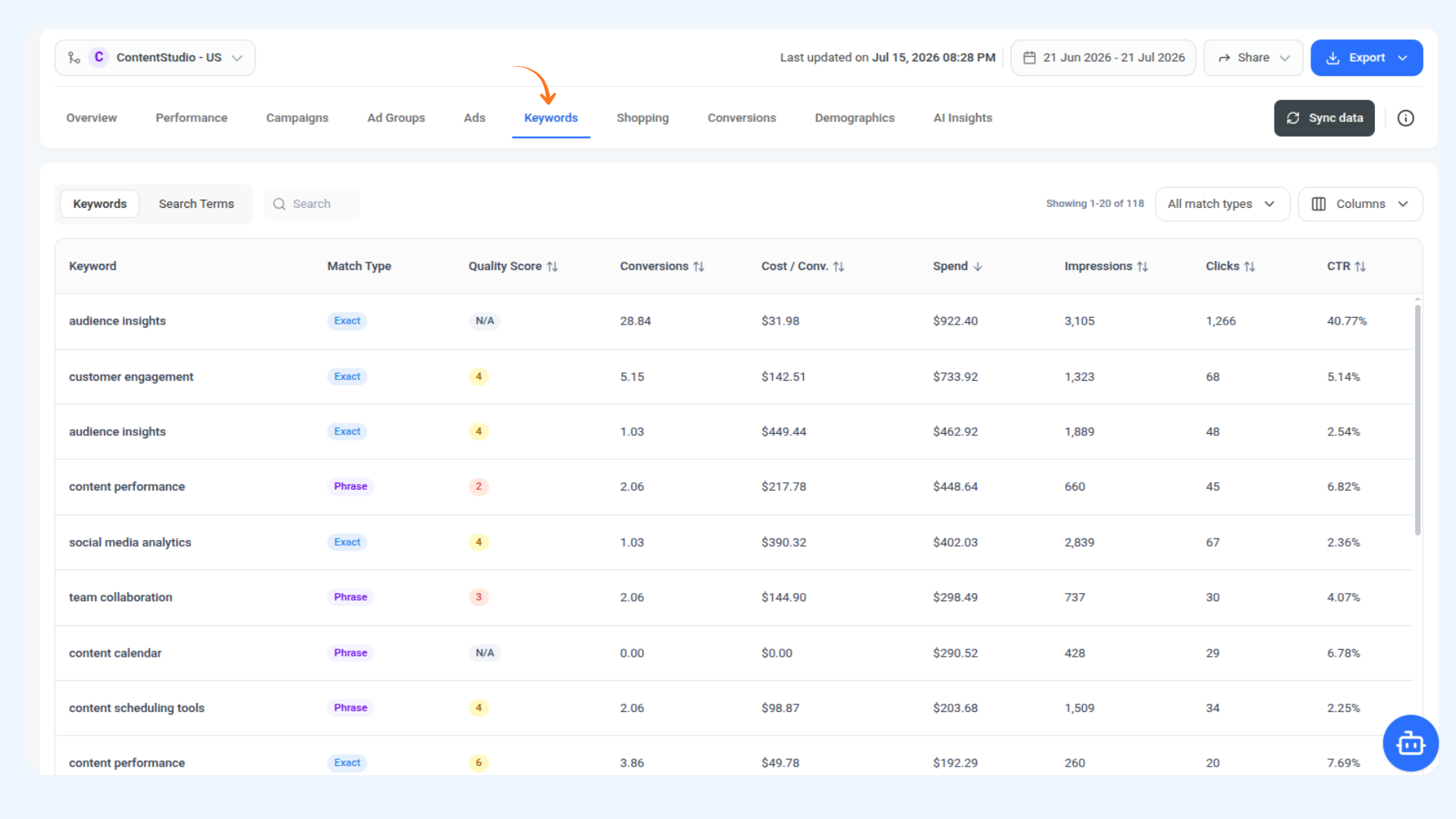
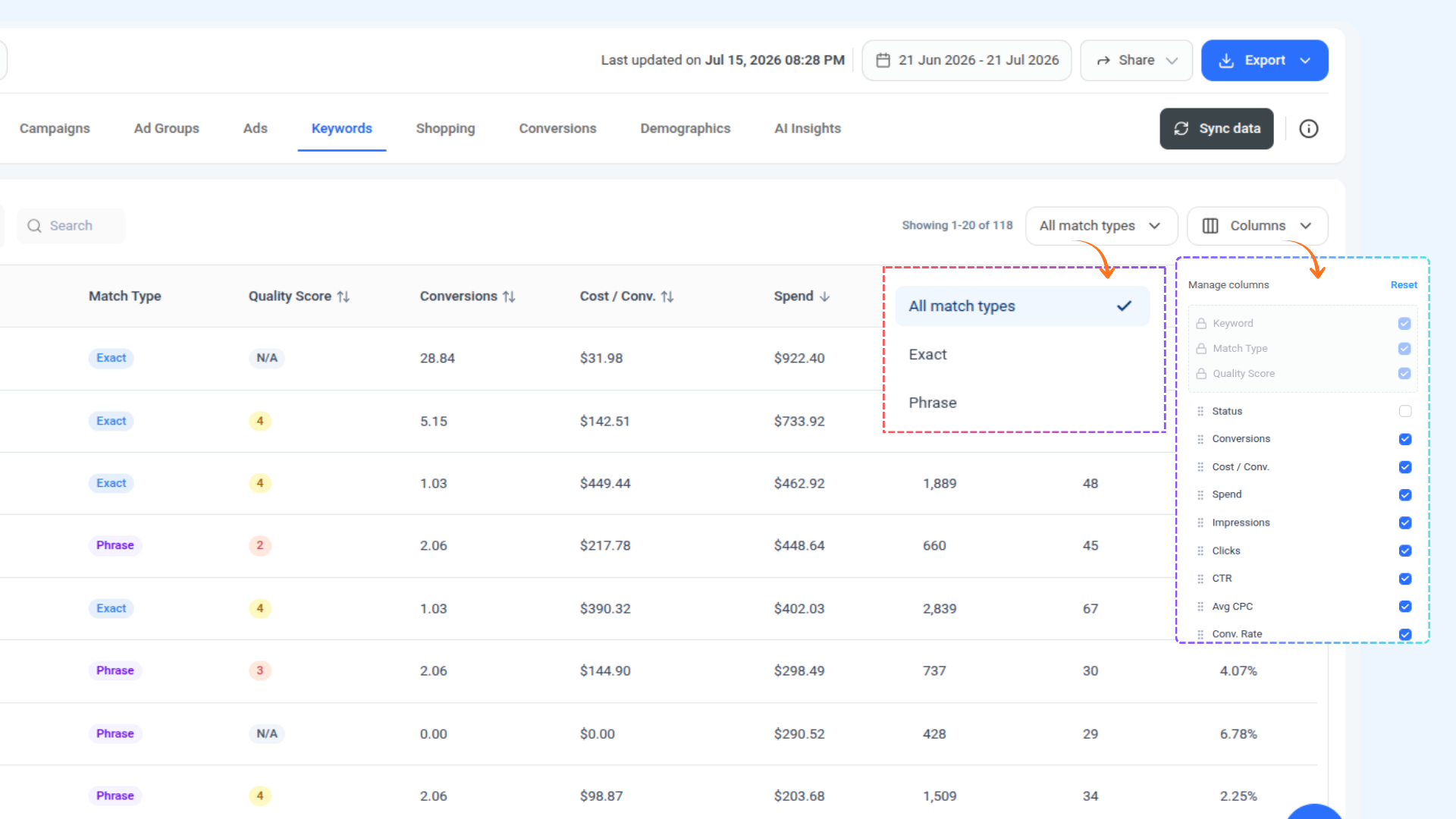
1 Keywords — Shows all the keywords you are actively bidding on, along with their match type, quality score, and full performance data including conversions, cost per conversion, spend, impressions, clicks, CTR, and average CPC. Use the All Match Types filter to narrow the table down to Exact or Phrase match. Use the Columns button to show, hide, or reorder the metrics you want to see, and click any column header to sort the table.
2 Search Terms — Shows the actual queries real people typed into Google that triggered your ads. Each row also shows which keyword it triggered and the match type. The same sorting and column management is available here too.
💡
Why Search Terms Matter Search Terms can surface queries you had not thought to bid on, or ones that are spending budget without converting. Reviewing this view regularly is one of the quickest ways to improve your keyword strategy without spending more.
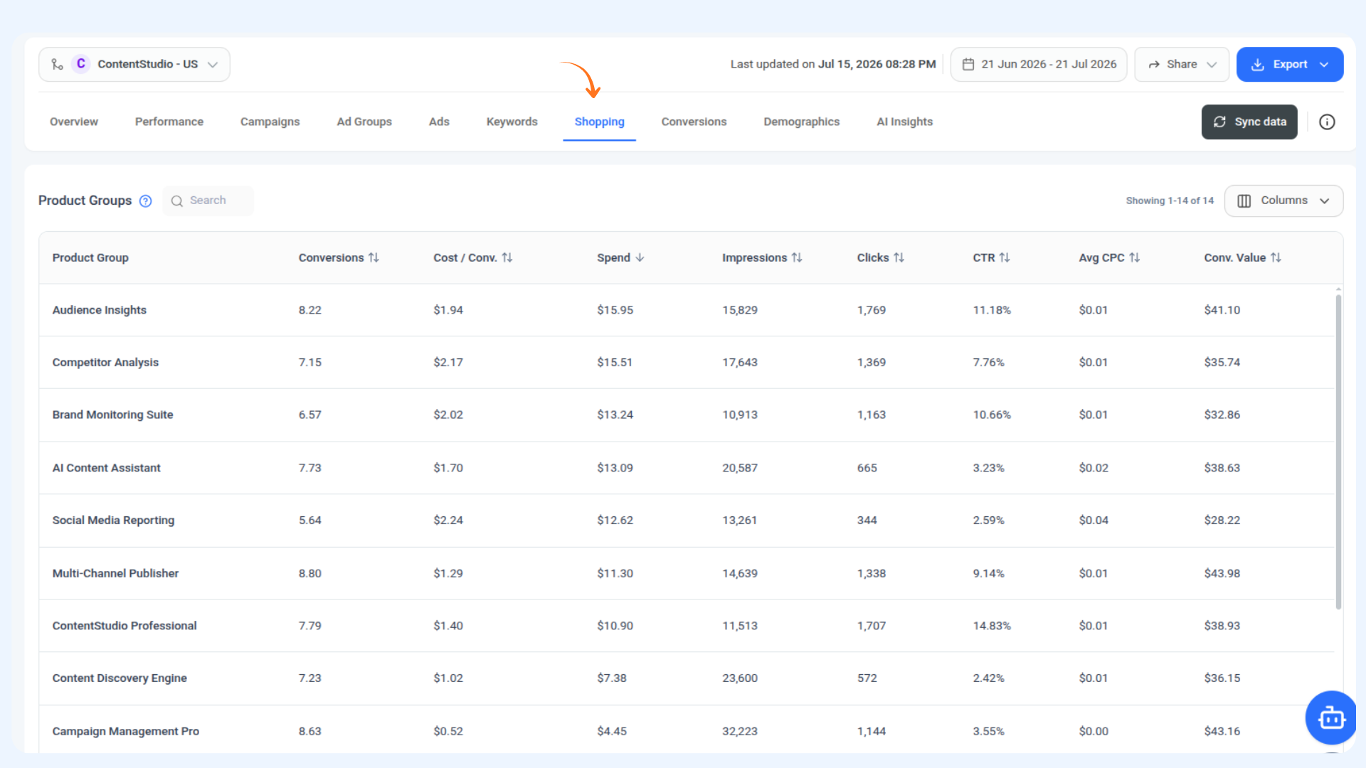
If you are running Google Shopping campaigns, this is where you can see how your individual product groups are performing. Unlike the other sections, it also includes Conversion Value and ROAS so you can see not just how many conversions each product group is driving but how much revenue they are actually returning for every dollar spent.
Search for any product group by name, use the Columns button to show, hide, or reorder metrics, and click any column header to sort the table however you need.
💡
ROAS at the Product Group Level Seeing ROAS broken down by product group makes it easy to spot which products are genuinely profitable and which ones are spending budget without returning enough value.
Conversions
If you want to understand not just how many conversions you are getting but where people are dropping off before they convert, this is the section to look at. You get a time-based chart, a funnel view, and a detailed breakdown table all in one place.
Conversions Over Time — A chart showing your daily conversions across the selected period, with each conversion action plotted as its own line so you can see how Account Registration, Product Purchase, Lead Form Submission, and General Conversion are each trending over time.
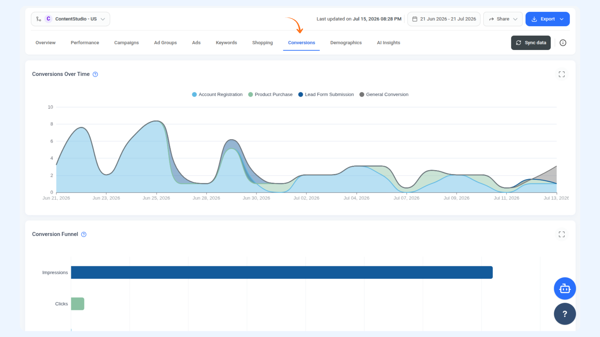
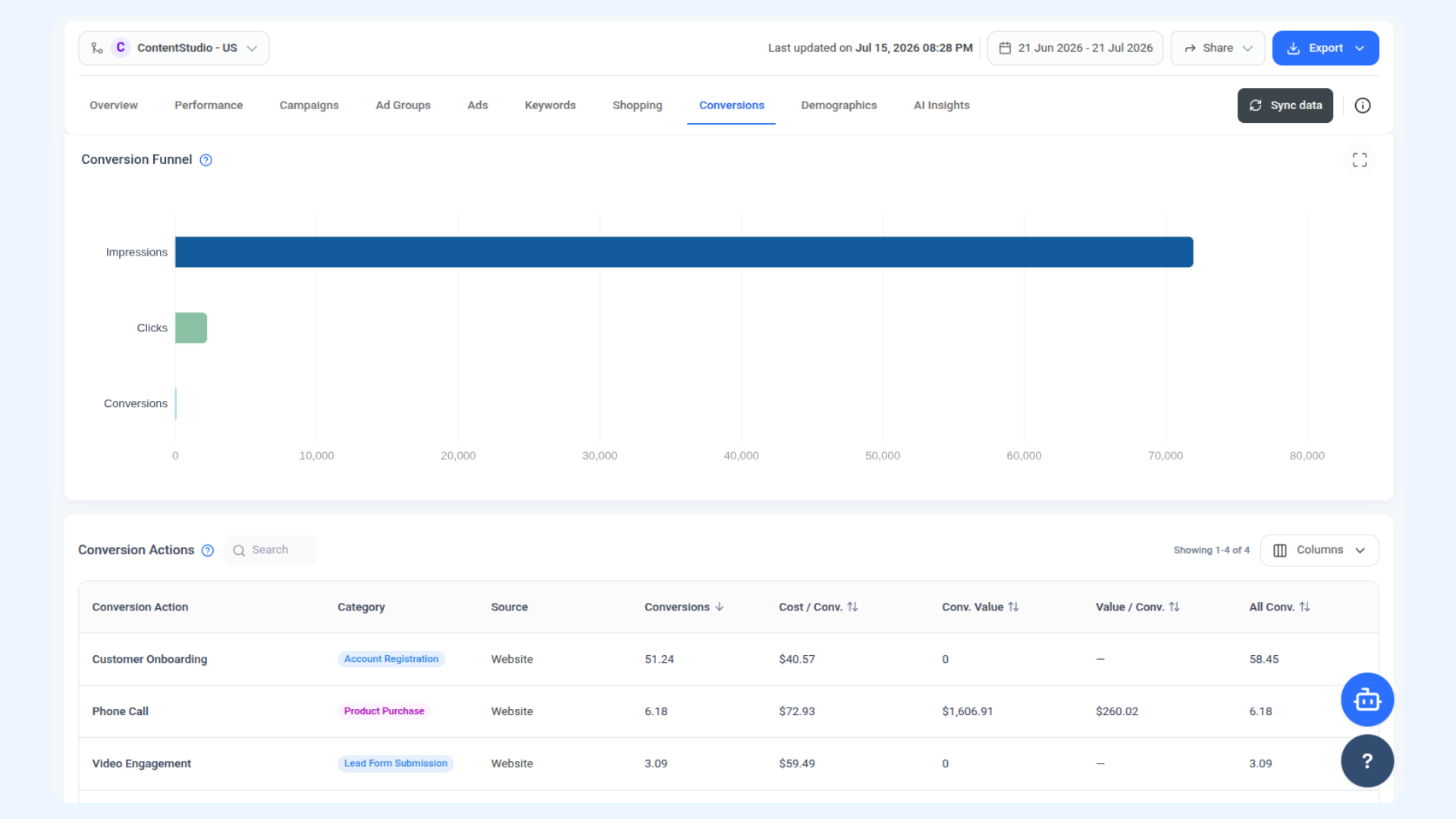
Conversion Funnel — A horizontal bar chart showing how people move from Impressions to Clicks to Conversions. Each step is smaller than the one before it, and a large drop between any two steps shows exactly where potential customers are falling off. If the gap between clicks and conversions is very large, for example, that points to a landing page or offer issue rather than an ads problem.
Conversion Actions — A table breaking down performance for each of your configured conversion actions, showing conversions, cost per conversion, conversion value, value per conversion, all conversions, and counting method. Search for a specific action by name, manage which columns are visible, and click any column header to sort.
💡
Reading the Funnel A big drop from Impressions to Clicks usually points to an ad relevance or targeting issue. A big drop from Clicks to Conversions usually points to something happening after the click, like a landing page that is not converting well.
Demographics
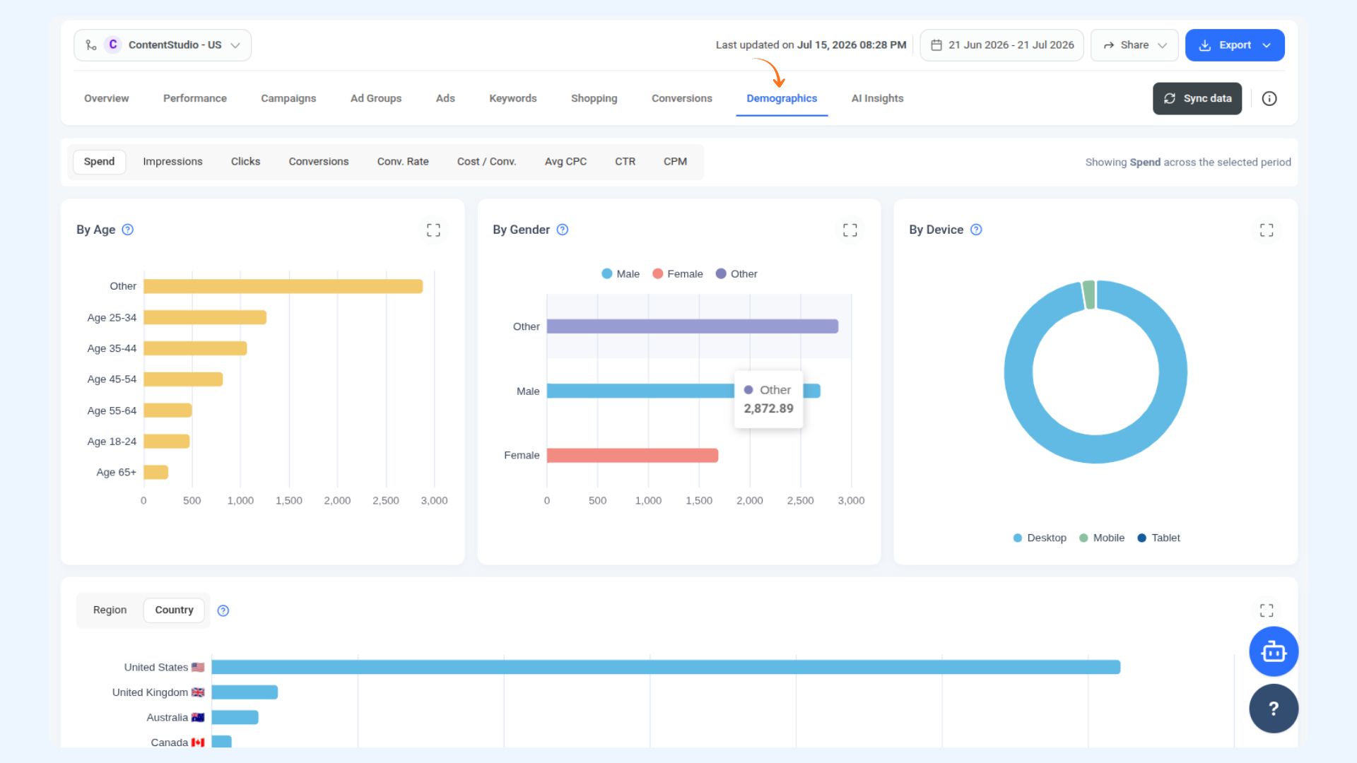
Knowing who is actually seeing your ads is just as important as knowing how they are performing. The Demographics section breaks down your audience across age, gender, device, and location so you can see if your ads are reaching the right people. Just like Performance, there is a row of metric buttons at the top — click any one of them to update all the charts below to show that metric. The layout below stays the same, only the numbers change.
By Age — A horizontal bar chart showing performance broken down by the age range of the people who saw your ads, as estimated by Google. Age groups shown are 18-24, 25-34, 35-44, 45-54, 55-64, 65+, and Other.
By Gender — A horizontal bar chart showing performance broken down by audience gender as estimated by Google, split into Male, Female, and Other. The Other category covers users Google could not classify.
By Device — A donut chart showing performance broken down by the device where your ads appeared: Desktop, Mobile, and Tablet.
By Region and Country — A horizontal bar chart showing performance broken down by the location of the people who saw your ads. Use the segmented control at the top left to switch between Region and Country view. When viewing by Region, use the All Countries dropdown on the right to filter regions down to a specific country.
💡
Same Layout for Every Metric All four charts update together when you switch between metric buttons at the top. So you can view the same age, gender, device, and location breakdown for Spend, Impressions, Clicks, Conversions, or any other metric without any extra steps.
AI Insights
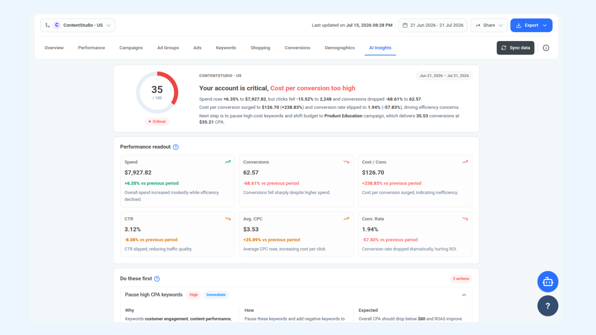
This is where everything comes together. Instead of you having to figure out what the numbers mean, AI Insights reads your account data and tells you exactly what is happening, what is causing it, and what to do about it first.
Account Health Score — The first thing you see is a score out of 100 with a status label like Needs attention. This gives you an at-a-glance read on how your account is performing overall, along with a plain-language summary of what is driving the score and what your next move should be.
Performance Readout — A snapshot of your key metrics for the current period compared to the previous one. Each card shows the metric value, the percentage change, and a one-line explanation of what that change actually means for your account. Metrics covered include Spend, Conversions, Cost / Conv., CTR, Avg CPC, and Conv. Rate.
Do These First — A prioritised list of suggested actions to improve performance, each tagged with a priority level and timeframe. Click on any action to expand it and see three things: Why the issue exists, How to fix it, and what the Expected outcome is if you follow through.
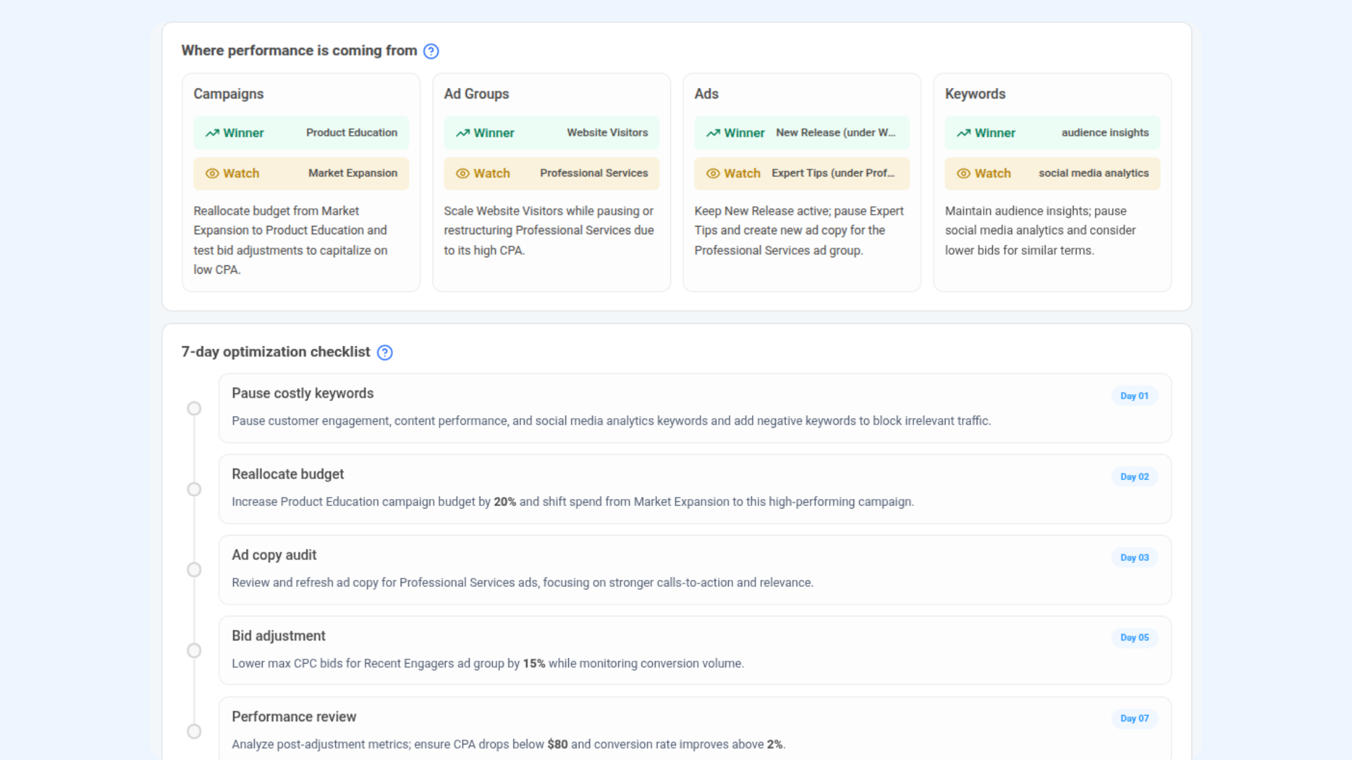
Where Performance Is Coming From — A four-column breakdown across Campaigns, Ad Groups, Ads, and Keywords. Each column shows a Winner (what is working best right now) and a Watch item (what needs your attention), along with a short recommendation for each.
7-Day Optimisation Checklist — A day-by-day action plan for the next seven days. Each item is tied to a specific task so you always know what to work on next without having to interpret the data yourself.
💡
AI Insights Updates When You Sync The analysis here is based on the data available at the time of your last sync. Click Sync data after making changes to your campaigns to get a fresh set of recommendations that reflect your latest account state.
FAQs
Which ContentStudio plans include Google Ads Analytics?
Google Ads Analytics is available on the Advanced and Agency plans, as well as users on a trial or lifetime plan. It is not included in the Standard or API plans. If you are on a plan that does not include it, you will need to upgrade to access this feature.
Why is my conversion data not showing up?
Make sure your Google Ads account is properly connected and that you have synced your data. If conversions are still not appearing, check that your conversion actions are set up and active inside Google Ads.
Can I connect more than one Google Ads account?
Yes, you can connect multiple accounts and switch between them using the account selector at the top of the page.
How often does the data update?
Data does not refresh automatically. Click the Sync data button whenever you want to pull in the latest numbers from your Google Ads account.
Can I share my analytics with someone who does not have a ContentStudio account?
Yes. Click the Share button and select Share Analytics to generate a link that anyone can view without needing to log in.
Can I export my Google Ads data from ContentStudio?
Yes. Click the Export button at the top and choose to export as a PDF, email it directly, or schedule it to be sent automatically on a recurring basis.
What does the account health score in AI Insights mean?
It is an overall rating of how efficiently your account is performing based on your key metrics. Anything below 70 usually means there are some areas worth looking into, and the AI Insights section will tell you exactly what those are.
How far back can I view my data?
You can go back up to two years using the date range picker at the top of the page.

